Insights on Retail
Store Signs and the Internet
Signs are your “silent salespeople”, and say a lot about your store and brand. And you need to make a personable impression.
Signs of the Times
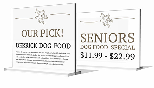
Customers are not just looking at specialty for a different shopping experience, they want it to be more of a shopping experience. The way customer’s look at merchandise signs, and the information they provide is changing dramatically.
They want signage that is detailed with lots of product information, customer ratings, and your opinion on what’s a great product. I can go to petco and buy dog food. They have aisles and aisles of it. Every brand imaginable. But I don’t know anything about dog food. I don’t know what what brand to buy! Please let me know – you’re the expert. Tell me what to buy! Communicate this is through signage.
The Basics –
The key thing is consistency. You want your customer to focus on the sign’s message, and not the sign presentation itself. Uniformity. Readability. They should be the same size, same layout , use the same font, font size and they should be identical except for the words themselves. They need to be free of tears, with no misspelled words. And uniform.
You’ll want to use card stock to make your signs, put them in an acrylic sign holders, and place them on tables and shelves.
To make the sign itself, create a template in Word (you can download these from my website). Use the template for all your signs, for uniformity’s sake. The size of your merchandise signs should be 4” x 6”. You can print 2 of these on an 8.5 x 11 price of card stock, and cut them out, or have signs pre-printed by a printing company.
Your logo personalizes your store, and makes it unique. It should be about the size of a quarter. You’ll want to use contrasting colors. I suggest a very dark color on white – Not so creative – and that’s exactly the point. Keep it simple, and readable. Signs are not the place for fun fonts. No comic book sans, no chalkboard – nothing that is not instantly readable.
If it’s a sale or clearance sign, then use some red.
For copy, choose a simple serif font. This is what people are used to reading in books and magazines – make the signs easy for them to read.
After printing, you’ll cut the signs out with an exacto knife, or use a paper cutter at Kinkos, or wherever you make copies.
You’ll display the signs in clear acrylic sign holders. These are available at Staples, Office Depot, or store supply companies. They are not expensive. Generally you’ll want 4” x 6” sign holders for merchandise signs. There are larger sizes available – an 8.5 x 11 sign holder would be useful for information at the register about return policies, and the like. There are also sign holders that clip onto shelves. You’ll probably need some of each kind of sign holder.
Never put a sign up with tape. Using tape instantly devalues your brand. It’s sloppy, and usually leads to tape residue on glass and fixtures. And the residue needs to be addressed.
In terms of copy, include as much information as you can – Beyond price, the defining feature of shopping on the web is lots of information – that’s what we’re getting used to. Give them that- Product information, customer reviews, your opinion – provide them the kind of information they’d see online. Tell your customers what to buy, that’s why they’re shopping in a physical store. “We recommend” or “Owner’s Choice”, are good phrases to use. Tell them what to buy.
If you’re a small merchant you may not have the bandwidth to write lots of copy – make it easy on yourself – copy and paste information from the vendors website, or you can copy and paste info from a shopping site. You can also get customer ratings there. You don’t want to print any copy that mentions the sites name, of course – you want them to buy it from you!
Of course, price is the main thing. If there isn’t a price, a customer needs to hunt someone down to find out what it is. If a staff member is right there – great. But they won’t be – you’ll have to hunt them down. Once you find one, they may be helping other customers, or ringing sales. Nothing is more frustrating than not being able to find a price. In an area with many products, like a table display, make a list of multiple items and their prices, Macy’s does this with bedding.
Hopefully I’ve given you some ideas for improving your store signage program. Please comment below if I can answer questions, or you have any other ideas.
Looking a lot like Christmas
Abundance is the message Christmas decor should communicate; an ample amount of product, and bountiful decor. Even with a small budget you can still create a great holiday environment; wide, full garlands, well decorated trees, and pre-wrapped product are all things everyone can do.
Looking a lot like Chrismas
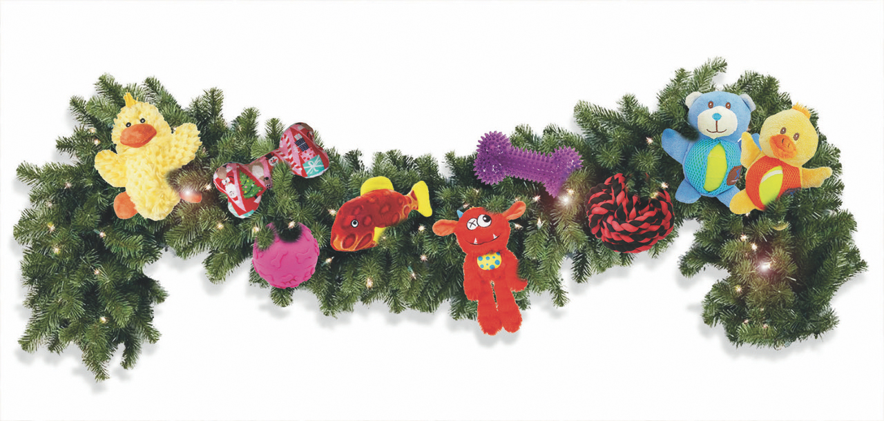
Abundance is the message Christmas decor should communicate; an ample amount of product, and bountiful decor. Even with a small budget you can still create a great holiday environment; wide, full garlands, well decorated trees, and pre-wrapped product are all things everyone can do.
Display companies are a great place to buy garlands and other decor. They’re cheaper, and the decorations are what the big retailers use. However, you can also use existing items you may have.
Trees are great, but they should be full and as deluxe as possible. Something fun is to decorate them with toys! A festive lighting idea is to use small white lights along with large, old fashioned colored lights. And trees need to be thoroughly decorated. An anemic tree is a negative, as your customers are comparing it to everywhere else they’re shopping, including your competitors.
Instead of having thin garland around the entire store, combine 2 or 3 thin garlands to make a thicker one. Then use it in fewer places.
Macy’s is a good place to get decorating ideas. Just ideas – no one has the money to decorate at Macy’s level. I’m referring to the store in general and not just the holiday shop. Go in and look at the trees, the big garlands, and the quality of their ribbons and bows. Get some ideas.
You will most likely have an end cap with Christmas specific product. A way to add another festive end cap is to double expose product, and do an end cap with all red product. It can be all red. Or green, but keep it to one color.
Pre-wrap is another way to add decoration to the store without spending a lot of money. If you have a lot of stock in a particular boxed item, make a stack and gift wrap them. As you’re now featuring it, you’re telling the customer you believe in the item, and wrapping it makes their life easier during a hectic time of year. Use simple gift wrap; red foil is great, and it adds color to the store. Don’t use patterns, and be consistent throughout the store.
Most people wouldn’t think shampoo is a good gift, but if the shampoo comes with conditioner and a brush, the customer will see it differently. Wrap a ribbon around a set of bath products, or better yet, put them in cellophane with a bow on top. This is frequently done in cosmetic’s departments. They put a number of a fragrance products in a basket, and put cellophane around it. It’s a much nicer gift than just a bottle of perfume, and they’re making bigger sales.
Window displays should be clean and simple. You want the customer to see the store from the outside, and see how full and festive it is. Framing the window with thick garland is a great idea. This is a great place for red, green or gold product.
Decorating a store for the holidays, is not like decorating a home. Customers have higher expectations. Remember, abundance is the goal. Here’s to a successful holiday season!
On the day after Christmas, it’s a really good idea to go to Macy’s, and buy decorations for next year at 50-75% off. Things sell out quickly, so go first thing.
Great Pyramids
It doesn’t take a professional visual person to do great window and in store displays. The reality is anyone can do it.
Great Pyramids
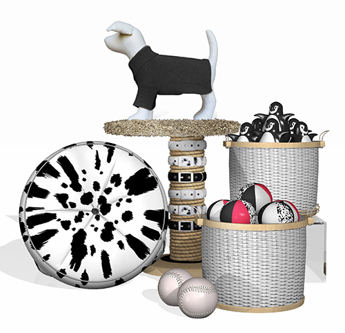
It doesn’t take a professional visual person to do great window and in store displays. The reality is anyone can do it. Visual people all follow the same guidelines, which is how they’re able to do great displays in very little time. You can make professional level displays yourself, if you just learn some of the basic rules.
With the exception of apparel, all merchandise visual is based on the “pyramid concept”. Pyramids are used in windows, on tables and valances.
Arrange 3 pieces of product in a tiered configuration, with each item at a different level. This is your pyramid; a tall central element with a two of three shorter items around it. The build up has height and brings the display closer to eye level. This is just the start, as you’ll add additional items later to fill out the display. But it’s always the pyramid configuration you’re going for.
A display needs to read from a distance. Itsy-bitsy items create clutter, and aren’t visually compelling. They can be used however, if they are used in quantity – multiples create a larger visual presence. You can also use risers to increase the height of a product. Simple risers are available from retail supply companies. You can also use common items to serve the same purpose. Crates and baskets are good choices, as are wrapped boxes. But keep it simple. You want the risers to be neutral, and not fighting for attention themselves.
Add 2 or 3 items to the original 3. These will fill out the display. The fewer items you have, the more impactful the message will be. The key here is focus – don’t add anything that isn’t right on message.
It’s okay to leave empty space on a display table or in a window. Empty space is not wasted space; it’s a frame for your display. It also makes the product and store look organized and clean.
Always keep in mind that a display needs to tell a story. The idea or concept is what makes impact. Cleverly combining various items also promotes add-on purchases.
Here are some concepts for dIsplays.
Valentines – this can be set up right after New Years. Although it seems early, Valentines is really about love, and not a specific day. Suspend cut out hearts above your display. But you want to keep it simple and use 3 to 5 hearts maximum.
Think Pink! Pull together pink items from different departments; collars, beds, and apparel. Use watering cans as props – make this your spring statement.
Senior pets. Combine products for older animals like special foods, supplements and comfy beds. Perhaps a bed full of supplements!
“Cats and fish”, or “dogs and cats”. Pick up some plush animals from the local toy store to clearly define the characters involved. What about a plush cat looking into an aquarium?
Winter. A great way to sell coats and sweaters is to combine them with artificial snow, and maybe a little prop pine tree.
An impactful display is as much about marketing as merchandising. It’s about lifestyle, and a place to make product shine, whether it’s seasonal items, or new arrivals. And it’s a dramatic way to communicate with your customers. Make each visit to your store fresh and exciting.
Illustration captions:
A basic pyramid of dog food bags. Note the additional bags serving as risers.
Black and white is always impactful and says “fashion”. A scratching post makes a great framework for displaying product.
One Handed Shopping
Hold a cup of coffee in the other hand, a fountain drink , a child’s hand, a dog’s leash; you get the idea. But use only one hand to shop.
One Handed Shopping

Hold a cup of coffee in the other hand, a fountain drink , a child’s hand, a dog’s leash; you get the idea. But never use that hand. Choose stores you’re interested in. Shop a Macy’s , a Gap, a Target, or fill-in-the-blank.
Look through apparel, folded shirts, higher face outs. Look for your size. Shop hard lines as well. Are the prices clearly marked? Can you reach everything? Do you have to reach over one item to get to another? Pick up something expensive; china or glassware. And refold a shirt with one hand.
Then do the same thing in your store.
Afterward, ask yourself these questions. Did you have to rummage through shirts on a table to find your size? Did you find you size easily on a face out or on a sale fixture. Were prices clearly marked? Were you able to navigate the store easily?
Many of your guests have only one hand to shop with. They’re holding a drink, a child, (perhaps a fussy one), a bag, etc. Can they easily find their size on tables and face outs, the prices, did they have to rummage through a table for a size? Were they able to refold a shirt – did they even try? Did anything fall down from a shelf or a face out they had do pick up. Did they need to reach over one product to find another? Were there plenty of room for them and a child?
A store should be merchandised with this in mind. If you can shop your store with one hand, then you’re a great merchant – probably better than a Macy’s or Gap, and there is nothing more to do. But if you can’t, you should re-merchandise with this in mind. A guest can easily get frustrated, and walk away. If a guest has to rummage through folded shirts to find their size, A) it will create more work for you and B) they don’t want to create more work for you – they don’t want to mess us your display. And they may walk. If something is stacked precariously, something may fall, and they’ll need to pick it up –and they’ll be embarrassed and they don’t want to create more work for you. They may walk.
That other hand may also be fighting for their attention. The coffee may be very hot or the cup may be over full or both. A child may be pulling them away, wanting to leave.
The only time a guest should need two hands is when they take out their wallet.
Get into the Grid
Fixtures that are too close together, or randomly organized, create a claustrophobic environment. Not only is it unpleasant for the customer, but will also effect sales.
Get into the Grid
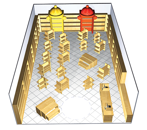
Your merchandising fixture placement is critical. A well thought out plan will make your store easier to shop, and create a clean, organized look.
Lay them out on a grid pattern, with each fixture at the same angle. There should be a minimum of 4’ between them. Think in terms of getting a double stroller through. You want a 6’ diameter space at the entrance to the store to serve as a decompression zone. The customer can stop and see the whole store before deciding what direction to go in. And main aisles should be about 6’ wide. Use fixtures that are about 4 1/2’ tall. The merchandise should not protrude above the top. Simple displays or signs can be an exception to this, but don’t obscure the view of one fixture by blocking it with another.
Fixtures that are too close together, or randomly organized, create a claustrophobic environment. Not only is it unpleasant for the customer, but will also effect sales. People need to be able to see everything on a fixture without bending down. If fixtures are too close to walls, it will make customers shop the fixtures, instead of the walls. And walls are more important, as they house more product, and create much larger merchandise groups, or stories.
Fixtures are something to spend a little money on. The nicer the fixture, the nicer your product will look. And you want to look different than the big-box stores like Pet Smart, even though the product may be the same. White fixtures are common, but I prefer light wood looks. They create a warmer environment and are still neutral.
Use vendor fixtures when absolutely necessary, but generally you want to avoid them. Only use them for products that don’t merchandise well on your standard fixtures. Book rack spinners are a good example of this, as they house a lot of product in a small amount of space.
Think of your fixtures as a canvas for your merchandise. With a clean fixture layout, your store will look organized, and the merchandise will be the star.
Snap Judgements
The customer is the expert. They shop everywhere – the Gaps, the Targets, the Macy’s. That’s what we’re compared to.
Snap Judgements

We’re the experts. We’re great buyers, great merchandisers, great planners, and great operators – we’re the experts on retail.
Wrong.
The customer is the expert. They shop everywhere – the Gaps, the Targets, the Macy’s. That’s what we’re up against. How do we measure up? Are our stores as organized as a Target? Merchandised as well as a Macy’s. Is our product sized and folded as well as a Gap? Are our stores visually enticing
The customer makes snap decisions about us based on what they’ve seen elsewhere; on/off – yes/no – good/bad. In a couple of seconds. After all, we make snap judgments all the time; about people, about places, about movies, about what interests us and what doesn’t. It’s in our DNA. When you look at your store think about what snap judgments are being made. Stand outside, at least 20 feet away, and look at your store front. What is immediately obvious? Is the store organized, merchandised well, does it look tidy? Is it clear what you believe in? Is it clear what you sell? Do you see major statements? Do you want to go inside? The customer makes these decisions in a few seconds; in a glance.
As merchants we tend to focus on what happens inside the store. But once the customer is in the store, we’ve already achieved our goal. We’ve already won!
The customers in the store are not the ones we need to entice. We want the people who aren’t particularly interested in what we sell. We want the people who don’t come into our stores. We need to get them interested. That’s the challenge. From 20 feet away, you are dependent on that very hasty decision; on/off – yes/no – good/bad.
Of course, the customer’s are making the same snap judgments at the front door and once they’re in the store. When a customer can’t find their size, if the product on a wall is random or if a hand written sign is taped to a fixture, we look like amateurs. Like we haven’t shopped Gap, or Macy’s, or Target. These are the stores we’re compared to; on/off – yes/no – good/bad.
Snap!
4 x 6 & 5 x 7 Sign Templates
This can be used in Word or Pages for merchandise sign layout